Wednesday, December 31, 2014

Predictions for 2015

First, a look at how last year's predictions turned out.

On balance, it was a good year. Here's what I got right and wrong:

Right: I was generally optimistic. I thought the economy would continue to grow at a sub-par pace but would beat expectations, which at the time were gloomy. I thought the failure of Big Government (e.g., Obamacare) would show up in the November elections as a mandate for less government and that this, in turn, would bolster confidence in the future, and I believe that has been the case. Real GDP growth for the year will likely be just shy of 3%, and that's meaningfully better than the 2.3% rate of growth we saw in the first four years of the current expansion. However, it still leaves the economy over 10% below were it would have been if this had been a normal recovery.

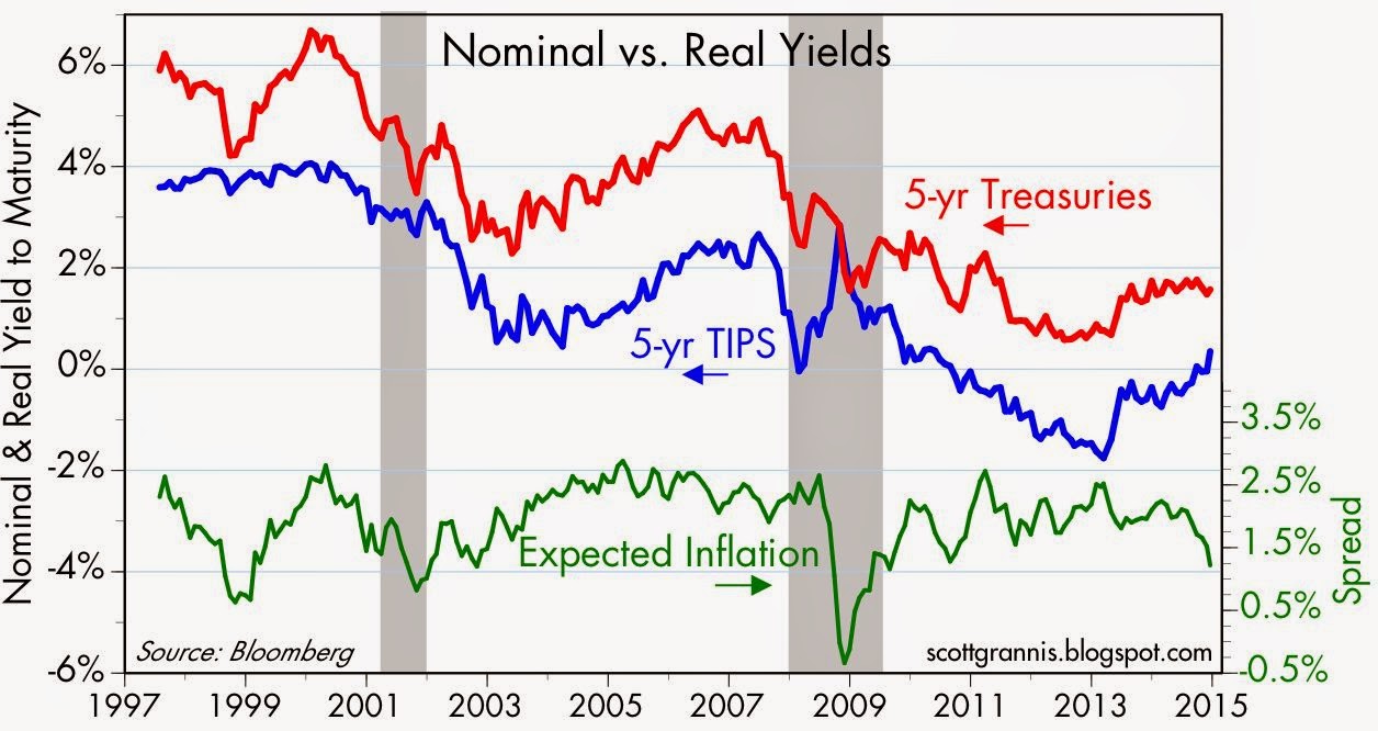
Wrongish: I thought that better-than-expected performance by the economy would result in higher interest rates. Nominal 10-yr Treasury yields fell significantly over the course of the year, but real interest rates (particularly real yields on 5-yr TIPS) increased significantly. This disparity (some real yields up a lot, most nominal yields down) reflects reduced inflation expectations (thanks to collapsing oil prices) and a stronger growth outlook, as I noted earlier this month. So I was half right and half wrong on this call. The rise in real yields is an important development that, arguably, is widely under-appreciated.

Wrong: Once again I was wrong on inflation, thinking that it would rise moderately. While headline CPI inflation did rise in the first half of the year, it subsequently fell, largely due to collapsing oil and gasoline prices, ending the year about unchanged at 1.3%. Core inflation was also unchanged, ending the year at about 1.7%. That's a happy error, since low inflation is better than higher inflation.

Right: I thought the failure of Obamacare (i.e., Big Government) would lead to important changes in the November election in favor of smaller government. Obama's big-government agenda was clearly repudiated, even if Obamacare wasn't overturned. Meanwhile, Obamacare faces steep hurdles in the Supreme Court next year, and a Republican-controlled Congress is likely to succeed in dismantling or improving the program significantly. In any event, I think the political tides have turned enough in market- and business-friendly direction to bolster confidence in the future.

Right: The Fed finished tapering QE3 by the end of the year, as I expected.

Wrong: But the Fed didn't raise rates sooner than expected, as I had thought they would have, given the improvement in the economy. Sharply lower energy prices and low recorded inflation validate the Fed's decision, so it's another happy error on my part.

Right: Cash was unattractive relative to almost every other investment alternative.

Right: Equities would continue to rise even as profits growth slowed because PE ratios would rise, and they did. According to Bloomberg, the PE ratio of the S&P 500 rose from 17.2 to 18.4 over the course of the year, and profits rose 4.3%, down from a 6.1% increase in 2013.

Wrongish: I thought investment grade corporate bonds were unattractive compared to high-yield bonds, but instead they had a positive total return of over 7% for the year, outperforming high-yield bonds that returned less than 3%. Both, however, beat the return on cash.

Right: I thought real estate was very attractive, and REITS were one of the strongest performers of the year. The total return on VNQ was over 30% for the year, vs. 13.7% for the S&P 500.

Right: I thought gold and commodities were unattractive investments. Gold was flat for the year, while industrial commodities fell some 7% and food prices were up only slightly. Oil prices collapsed by almost 50%.

Right: I expected the dollar to rise against most currencies, and indeed it did, gaining over 12%, mostly in the second half of the year as oil prices collapsed and real yields rose. The dollar benefited  mainly because the U.S. economy beat expectations and did better than most other developed economies.

Here's what I see in my crystal ball for 2015:

From a big-picture perspective, I think we're somewhere past the middle of a recovery that is going to continue to be relatively sluggish compared to past recoveries for the next year or two. The economy still faces significant headwinds (e.g., very high regulatory and tax burdens), but tailwinds are beginning to develop as government spending relative to GDP has fallen significantly (thus reducing future expected tax burdens) and oil prices have collapsed (thus reducing the cost of doing just about anything). The mandate of the November elections is likely to translate into more market-oriented and investment-friendly policies coming out of Washington in the years to come, and this expectation is already boosting confidence. The economy is not likely to strengthen significantly this coming year, but should do better than it has for the past several years.

I've worried for years that the Fed would be slow to react to a strengthening economy, and that this would fuel inflation. Turns out they've done a better job than most of us inflation hawks thought. I'm not ready to let down my guard, however, so I continue to worry that the Fed will fall behind the curve and allow inflation pressures to build. The rules of the game have changed meaningfully in the past several months, as oil prices have fallen precipitously and the November elections revealed deep-seated concerns among the electorate about an overbearing government and suffocating regulations and tax burdens. Both developments could end up giving us more growth and more optimism as time passes. Oil was very expensive  six months ago, and now—in inflation-adjusted terms—it is very close to its long-term average price (see chart below). This is likely to liberate a lot of economic activity around the globe, bringing with it more confidence in the future.

However, as I argued last March, "the return of confidence is the Fed's worst nightmare," since it would reduce the demand for money at a time when the Fed is still supplying plenty of it. Whether the Fed can respond in timely fashion to an unexpected decline in the demand for money remains the most important unknown variables for investors.


For the seventh year in a row, I think cash will prove to be an unattractive investment. The yield on cash is still very poor compared to the yields and prospective returns on most other investments. It would likely take a recession to make holding cash worthwhile. Barring a recession, which appears quite unlikely (swap spreads are very low, the yield curve is still positively sloped, real short-term rates are very low, and energy is much less expensive), the public's desire to hold cash will continue to erode, and that in turn will result in lower yields (and higher prices) on equities, real estate, and corporate bonds.

Real estate remains attractive, since it will benefit from a growing economy and it is an decent hedge against higher-than-expected inflation.

Even though profits growth is likely to continue to slow, there is still plenty of upside potential in equities via a continued expansion of multiples, which are only modestly above their long-term average (i.e, 18.4 vs. 16). Multiples are likely to be pushed higher in the absence of a recession and with help from very low interest rates, not to mention the likelihood of an improving growth outlook. The U.S. economy has plenty of idle capacity, idle labor, and capital that can be unleashed with the right combination of fiscal and monetary policies.

Investment grade corporate bonds are relatively unattractive given recent spread compression, but high-yield and emerging market bonds offer spreads that should compensate for higher market yields.

Gold continues to be an unattractive investment, since I believe it is still priced to a lot more inflation and economic weakness than we are likely to see. Commodities are likely to benefit somewhat from an improving outlook for the global economy—which is currently quite gloomy—but still do not offer a compelling investment opportunity at this juncture.

The dollar is likely to strengthen somewhat further, since it is still below its long-term average, and the U.S. economy is likely to once again exceed expectations and outperform most other developed economies. An earlier-than-expected shift by the Fed to begin raising short-term interest rates could also help boost the dollar.

I'm still optimistic, especially since I still see many signs of investor angst: e.g., an elevated Vix index, super-low Treasury and cash yields, and PE ratios that are only moderately above average at a time when corporate profits are setting records. Moreover, I see widespread fears that this year's drop in oil prices could trigger defaults and a wave of cutbacks in the oil industry that could have negative ripple effects throughout the economy. Given that the increase in oil supplies has swamped any reductions in demand (see "Cheaper oil is great news" and "Commodity prices are down, but they aren't cheap"), I think that a new bounty of cheaper oil should unleash lots of activities that were formerly uneconomical. And of course, there's all the hand-wringing over the possibility that the world's major economies might get sucked into a Japanese-style deflationary quicksand. The danger of deflation is exaggerated, and John Cochrane explained why in this post.

If there's any theme from recent years that is likely to repeat in the coming year, it is that equities will continue to climb walls of worry, as illustrated in the chart below:


Wednesday, December 24, 2014

Energy "crisis" is a drop in the bucket

This year's plunge in oil and natural gas prices—oil down almost 50% and natural gas down 35%—sparked fears that defaults on energy-related debt could trigger a broad-based economic slowdown and/or financial crisis. Those fears have largely subsided, however, likely because the market has had a chance to look at the numbers, and they are not very scary. The losses on energy-related high-yield debt in recent months represent only 2.2% of the value of the U.S. high-yield debt market, and a mere 0.1% of the value of the U.S. bond market.

Some relevant facts, all drawn from the BoA Merrill Lynch bond database as of 12/23/14:

Market value of all U.S. high-yield debt: $1.35 trillion
Market value of all high-yield energy debt at its August '14 peak: $0.21 trillion (15% of all HY debt)
Market value of all high-yield energy debt (current): $0.18 trillion
HY energy debt losses from peak: $0.03 trillion (14% of HY energy debt, 2% of all HY debt)
Market value of all high grade corporate debt: $5.1 trillion
Market value of outstanding Treasuries: $12.4 trillion
Market value of outstanding mortgages: $9.4 trillion
Market value of all U.S. Treasury, corporate and mortgage debt: $28.3 trillion
Market value of all U.S. equities: $23.4 trillion

The likely defaults on U.S. high-yield energy debt ($30 billion) are essentially a drop (0.1%) in a very large bond market bucket ($28.3 trillion).

$30 billion is a very small number compared to the total value ($51.7 trillion) of U.S. bonds and equities. Losses of this magnitude happen frequently and often many times each day.

Things were much worse in 2008, when HY debt suffered a total return loss of almost one third. The loss suffered by HY energy debt this year from the peak is 13%, whereas total HY debt loss has been only 3.3%.


Tuesday, December 23, 2014

More signs of strength

Today's revision to Q3/14 GDP growth was surprisingly strong (+5.0% vs. an expected 4.3%) and figures prominently in a series of indicators pointing to an acceleration of growth from the relatively miserable 2.3% trend that has prevailed for most of the current recovery. It's too soon, however, to expect robust growth, since marginal tax rates and regulatory burdens are still very high. If there's anything that is driving growth faster in the past year or so, it's the inherent dynamism of the U.S. economy, coupled with a decline in risk aversion and the emergence of some optimism. That is welcome, after years of deleveraging and strong demand for money and other safe assets. Going forward, cheaper energy prices are likely to give growth a further boost. We are most likely still years away from the next recession. Optimism is warranted.


The strength of the ISM manufacturing index has been a good leading indicator of the pickup in real GDP growth over the past several months. The chart above suggests that real growth in the final quarter of the year is likely to be in the range of 4% or so, which would give us growth of 2.7% for the year.


One widely-overlooked fact about nominal GDP growth in the third quarter (6.4%) was that it exceeded growth in M2 (3.2%) by a substantial margin. M2 is arguably the best indicator of the public's demand for money and money substitutes (i.e., currency, retail time and savings deposits, retail money market funds, and checking accounts). So the public's demand for money, shown in the chart above, has declined for the past six months (i.e., money balances relative to income have declined). That in turn implies that the public has somewhat more confidence in the future and is more willing to spend money rather than hoard it. Declining money demand also validates the Fed's decision to end QE3, since there is no longer a relative shortage of safe assets. (The primary purpose of QE was to transmogrify notes and bonds into cash equivalents, as I've argued numerous times in recent years.)

In the months and years to come, it's likely that nominal GDP growth will continue to outpace M2 growth (which is currently running about 5%) as the public's demand for cash and cash equivalents declines. Thus, a given stock of money will support a larger nominal economy, and therefore any tightening of monetary policy will not starve the economy of liquidity. By the same logic, there is no need to fear higher interest rates.


The chart above shows that the amount of credit card debt outstanding has stopped declining after an unprecedented collapse beginning in 2009. It is still about 21% below its recession high, but on the margin it is increasing (up 1.2% in the year ending September). I think this is a sign of reduced risk aversion and the return of some confidence. People no longer want to reduce their debt balances, and are now somewhat more willing to take on debt. Increased confidence is an essential ingredient to a quickening in the pace of economic growth.


The chart above shows that consumer loan delinquency rates are at all-time lows. This suggests that consumers have bolstered their finances significantly, by cutting back on outstanding debt balances and boosting their incomes (jobs and income are up in recent years). A healthier consumer is a more confident consumer, and a more confident consumer is more likely to take risks and work harder, and that in turn means more growth.


Bank lending to small and medium-sized businesses, shown in the chart above, definitely reflects more optimism. Businesses stopped deleveraging awhile ago and are now releveraging. At the same time, banks are more willing to lend. An increased propensity to borrow and an increased propensity to lend are both hallmarks of a decline in the demand for money and, by inference, an increase in confidence. The return of confidence is going to be the main theme in coming years.


The chart above shows the quarterly annualized growth rates of both nominal and real GDP. We can see the pickup in both over the past year or so. Some of the strength in the past two quarters was likely due to "payback" for the weak first quarter, so it's probably premature to extrapolate recent trends, which would otherwise point to 4-5% real growth. But at the very least it's now reasonable to think that growth has picked up from the sluggish pace of the last 5 years.


Even with the impressive growth rates of the past two quarters, real GDP remains over 10% below its long-term trend, as the chart above shows. It's going to take years of above-average growth to get back to where we ought to be. In the meantime, the amount of idle capacity (e.g., millions of workers who have given up looking for work) in the economy implies that collectively we are missing out on some $1.5 trillion of annual income. A reversal of the fundamentals that gave us sluggish growth in recent years (e.g., high marginal tax rates, heavy regulatory burdens, strong risk aversion, increased transfer payments, strong money demand, reduced risk-taking) would mean that future growth could be very impressive. Watch for Congress to make progress towards this end as bipartisanship returns in the post-Obama era. That was already evident in the recent Cromnibus bill which was decried by both sides of the aisle.


The market is slowly ratcheting up its growth expectations, but real yields are still very low from a long-term perspective. The chart above suggests that the current level of real yields on 5-yr TIPS is consistent with real GDP growth over the next few years of only 1% or so. This is a good sign that the market is still very skeptical of the future. Things are getting better, but we've got a long ways to go before we can say the market is unabashedly optimistic. I don't think it's reasonable to think we're in an equity "bubble" when real yields are still so low. The real equity bubble was in 2000, when real yields were 4% and the market expected real growth to be on the order of 4-5% per year. That reflected an abundance of optimism that is hardly the case today.


This last chart makes the same point from another perspective. Real yields on 5-yr TIPS tend to move inversely with the earnings yield on equities. When earnings yields were very high a few years ago, real yields were very low. Both were symptomatic of a market that was scared to death over the prospect of declining corporate profits and miserable real GDP growth. When real yields were very high and earnings yields were very low in the late 1990s, the market was very confident that earnings and the economy would continue to grow at impressive rates.

Now that earnings yields have declined and real yields have risen, the market is less concerned about things going sour, and somewhat more optimistic that we can see further improvement. But there is nothing in this chart that supports the notion that there is too much optimism embedded in market prices. On the contrary, there is still a healthy degree of skepticism out there, albeit less so. The current recovery is likely still in early innings.

Friday, December 19, 2014

Too much poverty, or too much aid?

In a report released earlier this month, the Census Bureau finds that "Almost two-thirds (65 percent) of children [in 2011] lived in households that participated in at least one or more of the following government aid programs: Temporary Assistance for Needy Families (TANF); the Supplemental Nutrition Assistance Program (SNAP); the Special Supplemental Nutrition Program for Women, Infants, and Children (WIC); Medicaid; and the National School Lunch Program."

Question: does this mean we have too much poverty in the U.S., or does it mean we have too much government aid?

The following charts might help to answer that question:


In 1970, the population of the U.S. was just over 200 million. Today it is approaching 320 million. When the food stamp program (SNAP) started in 1970, it covered about 1.5% of the population. Today it covers about 14.5% of the population—a ginormous increase by any standard. An increase of this magnitude could only be driven by a reduction in eligibility standards, because we are all richer today than ever before.


In 1951, government transfer payments amounted to only 5% of disposable income. Today, transfer payments total a staggering $2.6 trillion, and make up almost 20% of disposable income. The U.S. government is trying very hard—too hard—to address a supposed problem of "inequality" by massively redistributing income from the upper classes to the middle and lower classes. The problem is not that the poor have gotten poorer, it's that the poor haven't gotten richer to the same extent as the rich. Supposedly.

As Mark Perry notes in a post today, the average American has never had it so good—we enjoy an unbelievable level of prosperity. In inflation-adjusted dollars, for the price of a single color TV entertainment system in 1964, a family today "could furnish their entire kitchen with 5 brand-new appliances (refrigerator, gas stove and oven, washer, dryer, and freezer) and buy 7 state-of-the-art electronic items for their home (a Toshiba Satellite 14″ laptop computer, a Garmin 5 Inch GPS, a Canon EOS Rebel T5 DSLR Camera, a Sony 1,000 Watt, 5.1-Channel 3D Smart Blu-Ray Home Theater System, a Sharp 50 inch LED HDTV, an Apple iPod Touch 32GB MP3 Player, and an Apple iPhone 6)." That's why people who use food stamps can also sport smartphones.


The chart above corroborates Mark's findings. Real household net worth today is over $80 trillion, up over 400%—more than $66 trillion—from what it was in 1964. Living standards, as defined by how much you can buy with a given amount of work, have risen by an extraordinary amount over the years. Yet the government is handing out more money to more people than ever before.

The huge increase in income redistribution is almost entirely driven by a political agenda that refuses to recognize that the average person today is better off than kings were yesterday, and instead focuses on the "problem" that some of the rich have gotten more richer than everyone else has gotten richer. 

If there is a real problem today, it is the redistribution of wealth. It has grown to such an extent that two-thirds of our children are being taught to believe that they can only enjoy a modern standard of living with the help of government handouts. A few generations ago, America was proud to teach its children that anyone could become rich if he or she were willing to study and work hard. Today's children are being taught to believe that they are entitled to be rich, no matter how little or how hard they work. That is a prescription for decline and servitude and ultimately, great social unrest.

The answer to the question is obvious: we suffer from too much aid, not too much poverty.

Thursday, December 18, 2014

Commercial real estate boom continues

U.S. housing starts have almost doubled in the past 5 years, and according to Case Shiller, housing prices have recovered a bit more than half of their recession-era losses. But the recovery of the residential real estate market pales in comparison to the boom in commercial real estate, where prices have recovered substantially all of their recession-era losses and are rising at double-digit rates.


The chart above shows two measures of commercial real estate values as calculated by the folks at Co-Star Group. Their value-weighted measure of commercial property price indices has risen at a 10% annualized pace for the five years ended October 2014, and prices now exceed their pre-recession high. An equal-weighted measure is up over 14% in the past year. And these very positive trends continue. Here are some of the headlines:

Most major property types continued to benefit from minimal speculative construction, a firming economic recovery and rising rental rates.
The sale price-to- asking-price ratio narrowed by 2.5 percentage points in the 12-month period ended in October 2014 to 90.4% — the highest ratio since 2008. Meanwhile, the average time on market for properties listed for sale fell 4.3% in the 12 months ending in October 2014, and the share of properties withdrawn from the market by discouraged sellers continued to recede, falling to 35.3%.

We may be in a sluggish recovery, but that does not mean that everything is sluggish. I note that since October 2009, the total return of the Vanguard REIT (VNQ) is an annualized 19.5%, almost three percentage points per year better than the annualized 16.6% total return of the S&P 500 index. Year to date, the total return of VNQ exceeds that of the S&P 500 by over 15%. Wow.

Wednesday, December 17, 2014

Ex-energy inflation still 2%

The unexpectedly large decline in the November CPI (-0.3% vs. -0.1%) was almost entirely driven by falling oil prices. The CPI ex-energy rose 0.1% for the month and is up 1.9% over the past year.


The chart above shows the year over year change in the CPI and the "core" CPI (ex-food and energy). By these measures inflation has been bouncing around between 1% and 4% over the past decade, and currently looks to be declining a bit on the margin.


Most of the bouncing "noise" in the year over year measure disappears if we remove energy prices from the CPI. The chart above shows the CPI index ex-energy, and it uses a semi-log scale on the y-axis to show that the average annual rate of increase in the index has been 2.0% for the past 12 years. No sign of anything even remotely deflationary here. Once energy prices stabilize, we are likely to discover that CPI inflation is running right around 2% a year, as it has been for a very long time.

The Fed is unlikely to delay its plans to raise short-term interest rates just because the CPI index has declined in two out of the past four months (November and August). Any hint of deflation is entirely oil-related, and therefore not something that should concern the Fed.

Tuesday, December 16, 2014

The Laffer Curve at 40 years


This is my version of the Laffer Curve. What it shows is how basic economics and incentives work. If tax rates are zero, the government obviously collects no tax revenues. And if tax rates are 100%, the government also collects no revenues, because no one has an incentive to work. There is a tax rate "C" which maximizes the economy's strength and tax revenues. Higher rates produce a disincentive to work and invest, and thus reduce revenues, while lower rates also result in reduced revenues. If tax rates are too high (which is what Laffer originally asserted), then reducing tax rates can result in increased investment and work, thus increasing revenues by increasing the tax base.

But to see the original version and hear the key players recount their memories of where and when it was first drawn (forty years ago this month), and how it went on to impact fiscal policy during the Reagan administration, I recommend you read this BloombergBusinessweek article, "The Napkin Doodle That Launched the Supply-Side Revolution," which also includes a video.

Key takeaway:

How would you classify the Laffer Curve today?Laffer: It’s the same as always. It works. It’s not Republican, it’s not Democratic, it’s not conservative, it’s not liberal, it’s not left-wing, it’s not right-wing. It’s economics. People respond to incentives, and if you make something more attractive, they will do more of it. If you make something less attractive, they will do less of it. If you tax rich people and give the money to poor people, you are going to get lots and lots of poor people and no rich people. The dream in our country has always been to make the poor rich, not to make the rich poor.

As the BloombergBusinessweek article notes, the Laffer Curve proved to be one of the most special and disruptive events of the past 85 years. I consider myself lucky to have been mentored by both Art Laffer and Jude Wanniski.

Walls of worry update


The equity market is now in the midst of what looks like another wall of worry. The last wall of worry was all about Ebola, while this time around the market is worried about the collapse in the price of oil—down almost 50% since last June—and how that is affecting major oil producers, notably Russia, whose currency has lost about 50% of its value over the same period. This all amounts to a tremendous amount of change in a relatively short period, and that's enough to make anyone nervous. 

As the chart above shows, the ratio of the Vix index to the 10-yr Treasury yield (a proxy for fear and uncertainty) has spiked almost as much as it did during the height of the Ebola panic. The equity market hasn't sold off quite as much yet, however, but it's not hard to imagine that the oil panic and surrounding uncertainty will take some time to digest. 

Oil prices won't stop falling until producers cut back and/or consumers boost their oil consumption. That won't happen instantly, unfortunately. But there is little reason to think that prices are going to go down a black hole, and there's little reason to think that the world's oil consumers are going to decide to consume less now that oil is so much cheaper. It's easy for producers to halt new exploration, and it would seem that a halving of the price of oil ought to make a lot of wells unprofitable enough for their owners to shut down production, at least enough to chip away at the current oil glut. 

I note that the world survived an even greater oil supply shock in 1986, when the price of crude fell from $29/bbl in early 1986 to $8/bbl by mid-1986. It then bounced back to $18 by the end of the year. Nevertheless, that was a collapse of over 70% in a six-month period, and the world didn't end. GDP growth slowed briefly to 2.1% in the second quarter of 1986, but went on to post 3% growth for the year. I also note that the U.S. economy today is far less dependent on oil than it was in 1986. Oil consumption per unit of output has declined by over 40% since 1986, in fact.

UPDATE: For comparison purposes, here's an updated version of the "walls of worry" chart, as of the close of the market 12/17:


The inverse relationship between the market's fears and the price of stocks is remarkable. Fears peaked yesterday and subsided substantially today, mostly after the release of the FOMC minutes which revealed that the Fed has not changed its policy intentions. In addition, oil prices and the ruble bounced, both suggesting that yesterday's panic was overdone. Result: stocks rose 2%.

UPDATE1: As of the close of the market 12/18: the market now thinks that the big decline in oil prices is perhaps not so bad after all. Plus, the FOMC is behaving predictably, so uncertainty has subsided. Result? Another drop in the Vix/10-yr ratio, and a surge in stock prices:


I find this fascinating.

UPDATE2: As of the close 12/22, the level of fear is down further (though till elevated) and the S&P 500 is at a new all-time high.


Russia gets crushed again

Between Eurozone sanctions and the collapse of the ruble and the price of oil, the Russian economy has suffered enormously. But it's premature to count them out—they've suffered through worse and survived. For those who haven't been paying too much attention, here are some revealing charts:


The chart above shows the value of the ruble vis a vis the U.S. dollar. Since 1997, the ruble has lost 91% of its value. The most recent collapse is less than half as bad—so far—as the collapse that began in 1998 when Russia defaulted on its foreign debt.


The chart above shows an index of the value in dollars of the Russian stock market. Today it is worth about as much as at the end of 2008, during the depths of the global financial crisis. Since the pre-crisis days of 2008, the value of Russian equities, as measured in dollars, has fallen by 75%. Since last June, when oil prices started to collapse, the dollar value of Russian equities has fallen by about 55%.


The chart above shows the price of Arab Light Crude in rubles. At the end of the day, the devaluation of the ruble has just about completely offset the decline in crude prices; exporters of Russian crude today receive about the same amount of rubles per barrel as they have for the past three years. But that's only half the story: since 2010, Russian consumers today are paying over twice as much (in rubles) for imported goods and services. Eventually, that will result in a huge increase in Russia's inflation rate, which was just under 8% last June. The Russian economy is almost certainly in the midst of a recession, and on top of that inflation is going to be running in the very strong double-digits for the foreseeable future.

It reminds me a lot of what it's like to live in Argentina, and it's not pleasant. But it's not the end of the world, either.

Monday, December 15, 2014

The return of the bond market vigilantes

November industrial production was far stronger than expected, rising 1.6% (including upward revisions to prior months) from October levels. This is one more in a growing list of indicators (e.g., bank lending, jobs growth, the ISM manufacturing index, corporate profits, and commercial real estate) which suggest the pace of U.S. economic growth is accelerating after 5 years of relatively tepid 2.3% growth. However, despite evidence of a remarkable and rather broad-based improvement in the economic outlook, the Fed is still reassuring us that monetary policy will be accommodative for a long time to come. The Fed may be asleep at the switch, but, fortunately, not the bond market vigilantes.


U.S. industrial production is up a strong 5.2%% in the past year, and over the past six months it has increased at a 5.8% annualized pace. The Eurozone, unfortunately, continues to languish. The huge and growing gap between economic conditions here and in the Eurozone helps explain why the dollar has risen almost 20% vis a vis the Euro since 2011. The dollar's strength says more about the relative strength of the U.S. economy than it does about the Fed's monetary policy. But it does jibe with the market's expectation that the Fed is quite likely to begin raising rates in the foreseeable future, whereas the ECB is being forced to resort to more QE.


Activity in the mining sector has softened in recent months, falling by roughly 1%, no doubt due to the sharp decline in oil prices which has surely all-but-halted new drilling and exploration in the sector. The chart above—which excludes the mining and utility sectors—shows strong gains in manufacturing production, which is up 4.7% in the past year, and up at a 5.5% pace in the past six months. Manufacturing production has finally hit a new all-time high. 


The story is the same for business equipment production, shown in the chart above. It's up a very strong 6.5% in the past year. The U.S. economy will do just fine even if the mining sector stops growing.


According to the Fed (caveat: the Fed can only estimate, not actually measure capacity utilization) capacity utilization rates in the industrial sector of the economy have reached a post-recession high. As the chart above shows, capacity utilization rates today are almost as strong as they were before the Great Recession. Notably, the Fed's monetary policy stance (as reflected in the red line, which is the real Fed funds rate) has been very accommodative for a very long time. In past recoveries, the Fed responded much quicker to strength in the industrial sector—by tightening policy—than it has this time. This implies that the Fed is running the risk of being "too easy for too long." That (waiting too long to tighten) was one of the mistakes that contributed to the Great Recession and the rise in inflation which followed. Recall that the Fed held rates at 1% from mid-2003 to mid-2004, then began a slow-and-steady policy of raising rates for the next two years. The CPI rose from less than 2% in early 2004 to a peak of 5.6% in mid-2008 (a typically delayed response to a monetary policy error).


Fortunately, the bond market vigilantes are not asleep at the switch or fearful of the wrath of politicians. Since the end of June, as the chart above shows, real yields on 5-yr TIPS are up 85 bps. The bond market is coming down firmly on the side of an acceleration in economic activity. 


The bond market's energetic response to a quickening in the pace of economic activity has gone largely unnoticed, however, because—thanks to plunging oil prices—inflation expectations have declined by almost 1% since June. As the chart above shows, nominal yields have been flat while real yields have risen: last June, the expected rate of inflation embodied in 5-yr TIPS and Treasury prices was 2.14%, and today it is 1.23%. Don't look at nominal yields, look at real yields if you want the "real" story. Real yields are increasing because growth expectations are firming. Nominal yields are not increasing (and in the case of 10-yr Treasury yields, they have fallen by 50 bps since June) because inflation expectations have fallen.

Stronger growth and lower inflation is a terrific combination. But to judge from our skittish equity and corporate bond markets, it's not yet fully appreciated. 

Friday, December 12, 2014

Swap spreads say junk bonds look attractive

High-yield debt (aka junk bonds) has suffered almost a 10% drop in value since oil prices started to collapse last June. But 2-yr swap spreads have only increased about 10 bps over that same period, and are currently trading in "benign" territory (20-25 bps). This suggests that the junk bond selloff owes more to fears than to any fundamental deterioration in the economic outlook.


The chart above compares 2-yr swap spreads with the spreads on high-yield corporate debt. Swap spreads have often been good leading indicators of the health of the financial markets and the economy. In "normal" times they trade around 20 bps or so. Prior to the Great Recession they rose to "troubled" levels, and were a good predictor of tougher times to come; they then went on to be the first to signal the end of the recession well in advance. The recent rise in swap spreads has merely taken them from unusually low levels to "normal" levels. As such, this suggests that the more than 200 bps rise in junk bond spreads (the dividend yield on HYG has risen to just under 6% in the process) has more to do with fears that lower oil prices will trigger higher default rates among corporate issuers than it does with any fundamental deterioration in the broader economy. Yes, many energy-related issuers with heavy debt burdens are facing difficult times, but they are a relatively small minority in the greater scheme of things. Businesses that consume a lot of energy are doing very well (UAL, for example, is up some 60% since June).

Yields on high-yield debt are approaching 7%, and at that level investors are being offered a substantial yield pickup over Treasury debt, and a decent cushion against further declines in price. It's the bond market's version of "walls of worry."


TIPS see more growth, less inflation

Since March of last year, interest rates are up across the board, but some are up a lot more than others, and therein lies the tale—and it has a happy ending.


The chart above shows the nominal yield on 5-yr Treasuries, the real yield on 5-yr TIPS, and the difference between the two, which is the market's expected annual rate of inflation over the next five years. Since the end of March, 2013, nominal yields are up about 75 bps, but real yields are up about 200 bps. As a consequence, expected inflation has declined from 2.6% to just under 1.3%. As the chart also shows, expected inflation has only been this low or lower three times in the past 18 years, with two of those times being during recessions. Every time in the past that expected inflation has declined to the current level, it has been the result of falling nominal yields, and that usually occurs during times of economic weakness.

This time is different, since both nominal and real yields are up, and real yields are up by a lot. The big increase in real yields is great news, since it means the market is more confident in the economy's ability to grow. Nominal yields have fallen relative to real yields because the market correctly sees that inflation is going to be lower than expected, especially now that oil prices have fallen by 40% since March, 2013. But falling inflation expectations are coinciding with stronger growth expectations, and that's what is exciting and promising.


The relationship between real yields and the strength of the economy is shown in the chart above. The two tend to track each other, which should not be surprising. The real yield on TIPS needs to be competitive with the real growth rate of the economy, since the latter is what ultimately drives real yields on assets that in turn are driven fundamentally by the economy. By March, 2013, real yields had fallen to extremely low levels, which meant that the market was very afraid of another recession. Real yields have risen since then—even though growth hasn't yet picked up—because the market is looking ahead and seeing better growth fundamentals on the horizon. Recent evidence suggests that fourth quarter real GDP growth could bring us the first solid proof of a faster-growing economy. TIPS have been predicting that for awhile.

Real yields need to be higher still, just to be in line with expected growth, but we'll likely see that over the course of the next year.

The decline in inflation expectations is nothing to be worried about. Indeed, lower inflation is great for everyone except those who have too much debt. With the exception of the federal government, most households and businesses have undergone a lot of deleveraging since the Great Recession, so the private sector is in good shape to handle—and benefit from—lower inflation. As I noted the other day, the federal government's deficit is well on its way to zero, so even the public sector is not so exposed to the "dangers" of low inflation these days.

Arguably, the only thing we have to worry about here is the Federal Reserve worrying that low inflation is a problem.

Wednesday, December 10, 2014

Commodity prices are down, but they aren't cheap

There's lots of talk these days about the "collapse" of commodity prices, particularly crude oil, which has fallen by over 40% since last June. Many see falling prices as symptomatic of weak demand, and worry that another global growth slowdown is underway with policymakers helpless to avoid a disaster. But that's a hasty conclusion that ignores the other side of the supply-demand equation.


In the case of oil, we know that supply has increased enormously in recent years, thanks to fracking technology. As the first chart above shows, U.S. crude oil production is up over 80% since late 2008. As the second chart shows, U.S. oil consumption has fallen over the same period. Since 2008, the U.S. has added over 4 mbd to the global oil market, while at the same time reducing its consumption of oil by about 2 mbd. The net effect has been to add upwards of 6 mbd to global oil supplies. This strongly suggests that the collapse of oil prices is almost entirely due to increased supply, rather than weaker demand, in which case lower prices are a blessing, and not a portent of disaster. With lower energy costs we are very likely to see stronger economies going forward.


And even though oil prices have plunged over 40% in the past six months, oil is still relatively expensive from a long-term historical perspective. As the chart above shows, nominal crude prices today are up 400% from early 1999. 


The charts above show the history of nominal and real oil prices since the early 1970s. After adjusting for inflation, oil today is orders of magnitude more expensive than it was in back in 1970 and throughout most of the 1980s and 1990s. 


The chart above documents the incredible degree to which the U.S. economy has responded to expensive oil prices. Oil consumption per unit of output across the entire economy has fallen by over 60% since the early 1970s, thanks to more efficient technology and conservation efforts. Oil got very expensive, so we had an incentive to figure out how to use less of it, and we did. Big time. So our demand for oil softened, but only in a good way—we just don't need it so much.


The chart above shows the history of my favorite commodity price index since 1981. Yes, commodity prices are down 20% from their 2011 highs. But they are still up over 130% from their late 2001 lows.


The chart above shows the same commodity index, adjusted for inflation. Here we see that commodities today cost just about as much as they did over 30 years ago,


The chart above shows the inflation-adjusted prices of a broader commodity index (which includes food prices as well as industrial commodity prices). In real terms, commodity prices today are about 7% below their long-term average. Not expensive, but not cheap either.


Copper prices are down 35% from their 2011 highs. Does that make copper cheap? Hardly. Copper is still almost five times more expensive today than it was in 2001. Copper was cheap in the latter half of the 1990s, at a time when the economy was booming—real growth was over 4% a year. In an historical context, copper is still expensive, and that may be one reason why the current recovery has been the weakest on record. Viewed from that perspective, lower copper prices today are like a reduced headwind to growth. Good news.


So all the concerns about falling commodity prices may just be another "wall of worry" that the stock market will sooner or later overcome.

Federal deficit drops more than $1 trillion

Thanks to the U.S. economy's inherent ability to grow in spite of tremendous adversity, and thanks to a divided Congress that has kept spending from increasing, the federal budget deficit in the past five years has dropped by more than $1 trillion, from a high of almost $1.5 trillion to just $436 billion in the 12 months ended November, 2014. This is fantastic news.


As the chart above shows, federal spending has not increased at all since mid-2009. This is simply remarkable—we've never seen anything like this, and no one expected it to happen. Meanwhile, federal revenues have been increasing steadily—up over 8% in the past year—thanks to more jobs, rising incomes, strong corporate profits, and capital gains realizations.


Relative to GDP, the federal deficit for CY 2014 should be about 2.4%, based on my calculations. Five years ago it was over 10%! A 2.4% budget deficit is not a problem by any stretch of the imagination. Heck, at this rate we are going to be seeing surpluses starting by 2017.

Keynesians look at these numbers and tremble, because a decline in the deficit of this magnitude spells tremendous austerity. Supply-siders, in contrast, look at the decline in spending relative to GDP as a huge tax cut (federal spending is now about 20% of GDP, down from a high of 24.4% five years ago). A shrinking federal government and a rapidly shrinking deficit dramatically reduce the expected future burden of taxation. That, in turn, boosts confidence and should result in more investment, more jobs, and more growth in the years to come.

Another reason to cheer: there is absolutely no reason to consider any tax hikes. Indeed, Congress now has plenty of latitude to entertain beneficial tax cuts. If Obama wants to leave a positive legacy, he would be more than foolish to veto any bill that cut taxes.

Monday, December 8, 2014

Gloomy yield curve

Is the stock market overly enthusiastic about the future of economic growth and corporate profits? Some measures of investor sentiment suggest it is, and PE ratios are above average. But to judge by the bond market, the outlook for economic growth remains dismal. Which one is right?

The bond market currently believes that short-term Treasury yields are unlikely to rise above 3% for the foreseeable future (i.e., the next 5-10 years). Based on the current pricing of Treasuries and TIPS, the bond market further expects consumer price inflation to average about 1.4% per year over the next 5 years (thanks to falling energy prices), 2.1% over the subsequent 5 years, and 1.7% on average over the next 10 years. In addition, the bond market is priced to the expectation that real yields on short- and intermediate-maturity TIPS are unlikely to exceed 1% for the foreseeable future. It all adds up to a very gloomy outlook for the future of U.S. economic growth. The following charts help explain why.


The chart above shows the current Treasury yield curve (blue line), and the market's expectation for the yield curve 2 and 5 years in the future. I haven't shown the 10-yr forward curve because it is substantially similar to the 5-yr forward curve. For those unfamiliar with how the bond market works, forward yield curves are derived mathematically from the current yield curve. I've used Bloomberg's calculations as inputs to the chart.


The first of the above two charts shows the expected future path of the Fed funds rate, using Fed funds futures as the data source. The Fed funds rate used to be the Fed's primary interest rate target, but that's changed now that bank reserves pay an interest rate that is determined by the Fed. When the Fed starts to tighten (according to the futures market, sometime around the middle of 2015), they will simply increase the interest they pay on reserves, and presumably the Fed funds rate will follow rather closely behind. Here we see that the market expects the funds rate to reach about 2.5% within 5 years, which is consistent with the first chart in this post which shows the market expecting 3-mo. Treasury rates to be just above 2.5% within 5 years.

The second of the above charts shows the expected future path of 3-mo. LIBOR, using Libor futures as the source. 3-mo. Libor typically exceeds the Fed's targeted overnight rate by 20-30 bps, in order to compensate for banks' perceived credit risk. As the chart shows, 3-mo. Libor is expected to hit 3% within 5 years, and that's as high as it's going to get. This also is consistent with the 5-yr forward Treasury curve's projections of 3-mo. Treasury rates.

So, the bond market sees the Fed starting to raise short-term rates in about six months, and then raising them gradually until it stops in 5 years just short of 3%.

What does this say about expectations for economic growth? It's not very encouraging at all.


The above chart gives us some historical perspective. 10-yr Treasury yields have only been lower than 3% during the years following the Depression, and briefly in the years following the Great Recession; both periods were times of unusually weak growth and a lack of confidence. Yields were substantially higher in virtually all other periods. During the high-growth Reagan years, for example, when inflation averaged some 3.5% and real growth averaged about 4.5%, 10-yr yields averaged about 9.5%. During the strong-growth period of the Clinton years, when inflation averaged 2.5% and real growth averaged 4%, 10-yr yields averaged more than 6%. In other words, today's 2.3% 10-yr yield almost shouts "slow growth ahead!"

As the chart above suggests, nominal 2-yr yields have tended to approximate the nominal growth (inflation plus real growth) of GDP. Except, of course, for the past 10 years or so, when the Fed kept short-term rates unusually low for an unprecedented length of time. If we were living in "normal" times, today's 4% nominal GDP would give us 2-yr Treasury yields of 3.5-4%. But the bond market doesn't think we'll ever get back to normal again, because forward yield curves say 2-yr Treasury yields will never exceed 3%.


As the chart above suggests, real yields on 5-yr TIPS have tended to move in line with the economy's real growth rate. When real growth was very strong (4-5%) in the late 1990s, real yields were very high (3-4%). Now that growth has slowed considerably (averaging 2.3% for the past 5 years), real yields have traded within a -2 to 0% range. Real yields have moved up a bit over the past year or so as the market has stopped fearing another recession, but real yields on TIPS are still priced to miserable growth expectations. Based on forward curves, real yields on 5-yr TIPS are expected to rise to 0.8% within 5 years. According to this chart, that would be consistent with real economic growth of only 1-1.5% per year.

In short, the bond market is behaving as if growth and inflation are going to be unusually low for the foreseeable future, and that therefore the Fed is not going to increase short-term rates by more than 3% over the next 5 years. The last time the Fed tightened, they increased the Fed funds rate from 1% in mid-2004 to 5.25% over the subsequent two years. The bond market is now looking for only a 3% increase spread out over 4 ½ years. If that isn't a timid projection, I don't know what is. The Fed is likely to pursue such a path only if the economy proves to be very weak and inflation stays unusually low.

If there's one thing positive to say about the yield curve, it's that it shows no indication of an impending recession for the foreseeable future. All recessions in the past 50 years have been preceded by flat or inverted yield curves, and we're miles away from that at present.

I would argue that the expectations of the stock market are necessarily entwined with the expectations of the bond market. They're both essential parts of one gigantic capital market. The stock market can't be "overpriced" if the bond market is convinced we're stuck in a slow-growth, low-inflation world for as far as the eye can see.

Consider: the bond market is saying that the proper discount rate for expected future earnings is 3% or so. That alone would justify PE ratios substantially higher than the long-term average, since discount rates have rarely been so low in modern times. Plus, are stocks expensive if their earnings yield, currently 5.5%, is substantially higher than anything we're likely to see from the Treasury market, and higher than BAA corporate bond yields? A relatively high earnings yield only makes sense if the equity market is priced to the assumption that corporate profits are going to decline in coming years.

To answer the question posed above, both the bond and equity markets are "right," because they are both priced to similar assumptions. That is, both markets believe we're going to be stuck in a very slow-growth world for many years to come, and inflation is going to be relatively low and stable (1.5-2%) once we get past the current period of falling oil prices. By the way, I think the pricing that is implicit in bond and stock prices trumps whatever investor sentiment surveys reveal. After all, "the market" incorporates the bets of everyone, not just those selected for a particular survey.

I've held the view that the market has been consistently underestimating future growth for the past 5-6 years, and I suspect it still is. As for inflation, I've been wrong to expect it to rise, but I continue to believe that there is more risk of higher inflation than there is of lower inflation. In a similar vein, I continue to think interest rates are likely to be higher than the bond market's current projections, even though I've been wrong on rates for years.